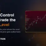
You drew your support and resistance with horizontal lines. Price blew right through them. You got faked out on the breakout, stopped out on the retest, then watched the move happen without you. Sound familiar? The problem isn’t your discipline — it’s that you’re marking levels the entire retail crowd marks, while the real reference point sits invisible on your chart.
That reference point is the Point of Control. And once you understand how it works, you’ll stop guessing where price wants to go and start reading where it has to return.
What Is Point of Control (POC)?
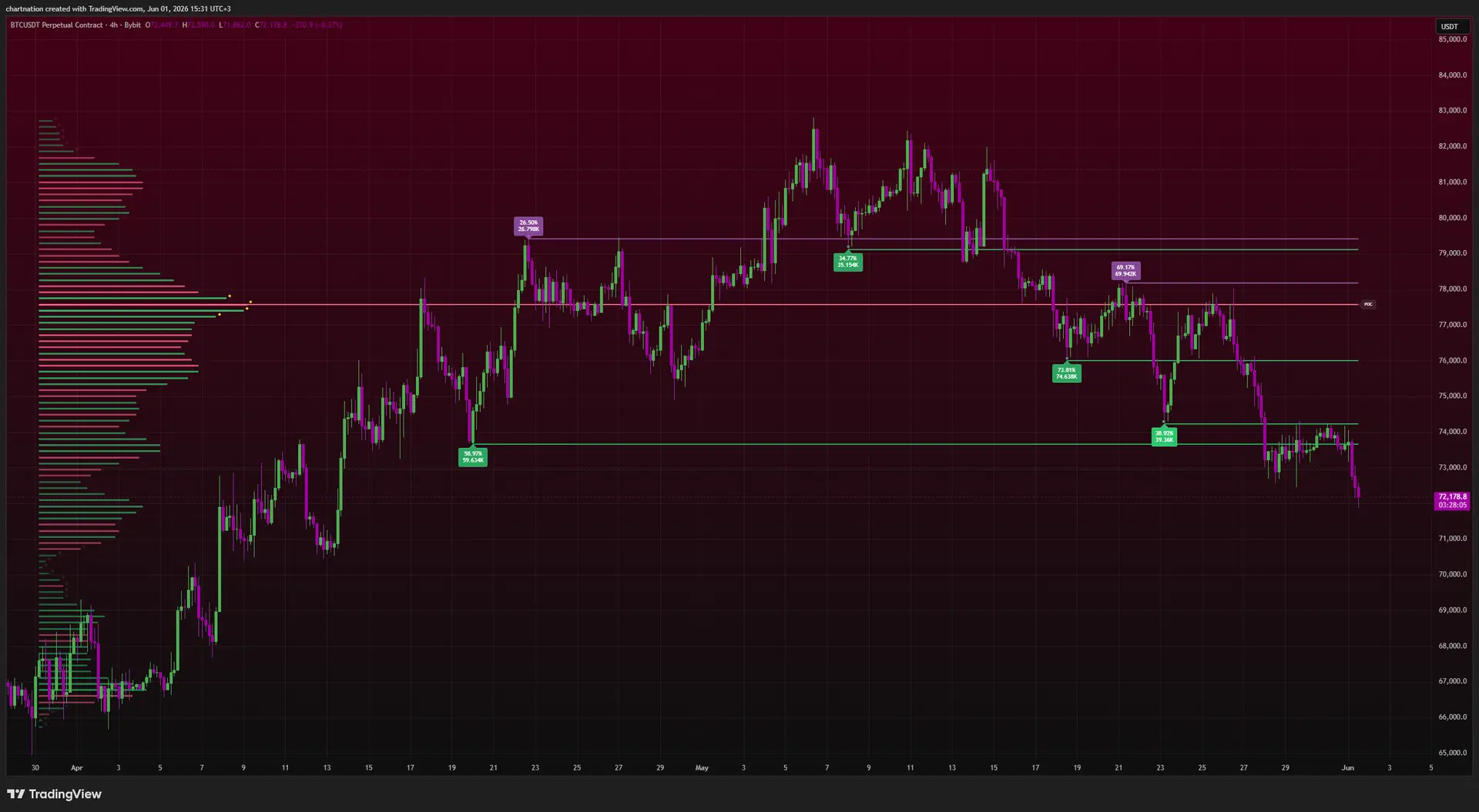
The Point of Control is the single price level where the most volume traded over a given period. It’s the peak of the volume profile — the fat part of the bell curve where buyers and sellers did the most business.
Why does this matter? Because volume is where commitment lives. A wick to a price with no volume is noise. A price where millions of contracts changed hands is accepted value. The market agreed that price was fair. And markets have a habit of returning to where they last agreed on fair value — that’s why POC acts like a magnet.
Support and resistance tell you where price touched. POC tells you where price lived. Those are not the same thing.
This is why standard horizontal lines fail you. A swing high is one print at one moment. The POC represents thousands of transactions. When you trade off the level with the most participation behind it, you’re trading with the order flow — not against it.
Why POC Acts Like a Magnet
Think about who is positioned at the POC. That’s where institutions filled the bulk of their orders. When price drifts away — say BTC rallies $1,500 above the session POC on thin volume — the move is fragile. There’s no volume foundation under it. Price tends to get sucked back toward the high-volume node to either accept that new range or reject it.
Here’s the mechanic in plain terms:
- Price above POC, low volume on the move: Often a fade back toward POC. The breakout lacked participation.
- Price below POC, volume building: A potential accumulation zone before a push back up to value.
- Price sitting on POC: The market is in balance. Wait for it to leave with volume before you commit.
This is the institutional-vs-retail gap in a nutshell. While retail chases the candle, smart money is reading where value was built and fading the moves that drift away from it.
How to See POC on TradingView
TradingView has a built-in fixed-range volume profile, but it’s clunky, slow to adjust, and doesn’t tell you which nodes actually matter. This is exactly the problem Volume Matrix Pro — ChartNation’s free indicator — was built to solve.
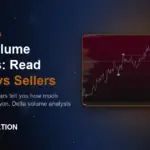
Volume Matrix Pro plots delta-colored volume bins so you instantly see whether the volume at each price was driven by buyers or sellers, then auto-detects the Point of Control along with High Volume Nodes (HVN) and Low Volume Nodes (LVN). You don’t have to eyeball a profile and guess where the fat part is. The POC is marked for you, and it adapts as the range develops.
That distinction matters. A static POC line you drag onto the chart is a snapshot. An adaptive POC that updates as new volume prints keeps you aligned with where value is being built right now — not where it was an hour ago.
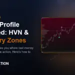
The supporting cast: HVN and LVN
POC is the headline, but the surrounding structure tells the story:
- High Volume Nodes (HVN): Price areas with heavy trading. These act as walls — price slows down and chops here. Great for targets and reversal zones.
- Low Volume Nodes (LVN): Price areas with thin trading. Price slices through these fast because nobody wants to do business there. These are your acceleration zones.
When you combine them, you get a roadmap: price rejects from an HVN, races through an LVN, and gravitates back toward the POC. That’s a trade plan, not a guess.
Three Concrete Ways to Trade the POC
1. The mean-reversion fade
Say ES futures gap up at the open and run 12 points above the prior session’s POC on declining volume. The move is stretched and unsupported. A trader using Volume Matrix Pro sees price extended away from the POC with no new HVN forming above. The high-probability play is the fade back toward the POC magnet — entry on a momentum stall, target the POC, stop above the failed high.
2. The POC bounce in trend
In an uptrend, pullbacks to a rising POC are some of the cleanest entries on the chart. On XAU/USD during a strong push, gold pulls back into the developing session POC where buyers originally loaded up. That’s where demand sits. You’re entering at value alongside the participants who built the level — not chasing 30 points into resistance.
3. The breakout filter
Most retail traders get destroyed on breakouts because they don’t check whether volume confirms the move. Before you trade a breakout above an NQ range high, look at where the POC sits relative to the breakout. If the POC is migrating up toward the highs, volume is following price — the breakout has legs. If the POC stays glued to the middle of the range while price pokes the highs on thin volume, that’s a fakeout waiting to snap back. POC migration is your filter.
Multi-Timeframe POC: Where Real Confluence Lives
One POC is useful. Stacking them is where it gets powerful. The daily POC, the weekly POC, and the session POC each carry weight. When two or more line up at the same price, that level becomes a high-confluence magnet — price tends to react hard there.
For traders who want to go deeper than the free tool, Volume Dynamics Pro takes this to the next level with advanced volume profile analysis — butterfly profiles and gradient bias that show you not just where the POC is, but how value is shifting across the distribution. Pair that with Flow Dynamics Pro, which scores institutional order flow zones on a 0–100 confluence scale, and you can confirm whether smart money is actually defending a POC or quietly abandoning it.
That’s the layered approach that separates a real edge from a single indicator: the POC tells you the magnet level, order flow tells you who’s defending it, and pattern detection tells you the structure around it.
Common POC Mistakes to Avoid
- Treating POC as a hard line. It’s a zone of attraction, not a precise turn-on-a-dime level. Give it room.
- Ignoring the timeframe. A 5-minute POC is meaningless for a swing trade. Match your POC timeframe to your trade horizon.
- Fading every move back to POC. In a strong trend, price can leave the POC and never look back. Use volume — is the move supported or hollow?
- Forgetting POC migrates. A developing POC moves with new volume. Watch the direction it’s drifting; that’s your bias.
Start Reading the Magnet Levels
POC isn’t a magic line — no level is. It’s a high-probability reference built on real participation instead of arbitrary price touches. Once you see where value actually lives, the chops, fakeouts, and stop-runs that used to wreck you start making sense.
The good news: you can start right now. Volume Matrix Pro — with delta-colored volume bins, HVN/LVN detection, and adaptive POC — is free on TradingView. And the full institutional suite, including Volume Dynamics Pro and Flow Dynamics Pro, is yours to test on a 7-day free trial.
Stop drawing lines the whole market sees. Start your 7-day free trial at ChartNation and trade the levels that actually move price.
Trading involves significant risk of loss. ChartNation indicators are tools for analysis only and do not constitute financial advice. Past performance shown is not indicative of future results.